
Sunday, 16 January 2011
News Update
Well you may have noticed the tumbleweed on this blog of late, and I can only apologise. It's been a manic few months with lots of exciting new jobs and a considerable amount of business planning on my part. I've got some big changes coming very soon and whilst I'm in the process of putting these into action this blog will be on a short break. In the mean time if you are looking news, hot links and general design/ life babble why not follow me on twitter.


Thursday, 12 August 2010
Rousler Carbon
Rousler Carbon approached me with the need to expand upon their original company logo for their business specialising in bespoke high performance, low weight Carbon Fibre equipment, primarily for the motor sport industry.


Whilst happy with their original logo they needed a uniform set of logos for single colour applications such as t-shirt embroidery and car decals.
The first step taken was to refine the primary full colour logo. Whilst retaining it’s original characteristics I developed the 3D feel with more realistic shading and added a subtle carbon texture to the Rousler lettering. The colour palette utilises a darker red to add intensity. A uniform set of single colour variants were also produced.


A secondary logo was also developed without the containing lozenge for height restricted applications, such as perimeter board sponsorship, again with a uniform set of single colour variants.
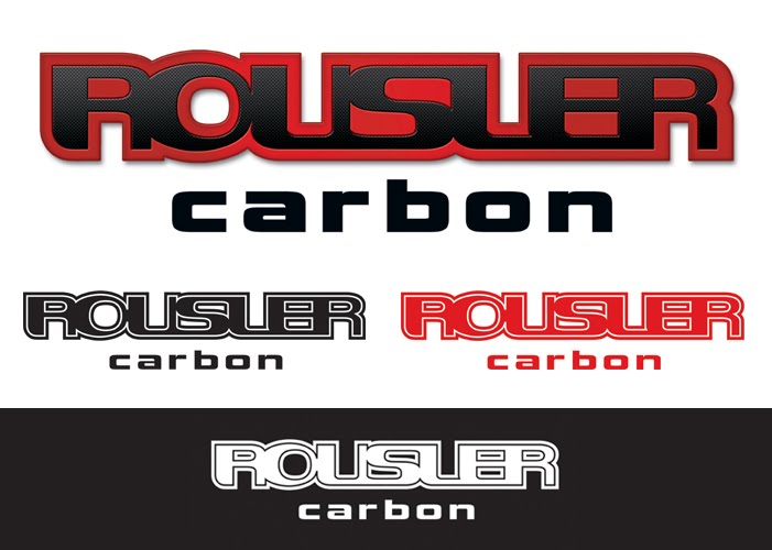
A final version of the logo was produced for very small scale reproductions such as product stickers. This version has looser kerning and has been stripped back to increase legibility at small scale.

The company also required basic brand guidelines to be produced as well as standardised templates for word documents and PowerPoint presentations.

Friday, 4 June 2010
Recent Design Work
Once again I've been a little lax on the blogging front, but not without good reason. It's been all systems go for the last few months with my regular clients all busy and some new client wins. Hopefully good signs that the economy is getting a little more stable and marketing budgets are returning, but only time will tell.
Also worth noting is the company's Facebook presence. Lots of small businesses are setting up Facebook pages but don't really do anything to warrant becoming a 'fan', or provide any use other than shameless plugging. Lily Lolo's is a shining example of how to do it right, with plenty of discussions, tips, information videos, and Q & A. The amount fans and user generated activity speaks for itself.


To prove I've not been slacking take a peek at some of my recent design work for a lovely new client Lily Lolo Mineral Cosmetics. Great to work with a company that really invests in their on and offline marketing and work with some beautiful photography. Shown below are some recent posters, newsletters, e-mailers, year planners.


Tuesday, 20 April 2010
13th Street Identity


Beautifully executed (no pun intended) and good on the client for obviously not being afraid to go the whole hog with the concept. Well worth checking out his portfolio on the site too, top notch.
Tuesday, 9 March 2010
The Session Album Artwork


Well I really have no clue where the time is going at the moment, the start of the year has flown by. I've got big plans for 2010 and am busy getting some schemes in order for the start of the new financial year so I'll keep you updated.
Anyway another little project I've just finished up is the album artwork for Coventry based band The Session. Really enjoyable project as other than some samples of the style of artwork they liked I had total creative freedom.
The band needed a emblem/ logo and designs for the inner and outer sleeve. The emblem and cover illustration takes inspiration from folk art and also utilises a 17th century etching for the basis of the outer sleeve. The inside spread is a collage of photographs I took from the studio and bits of equipment used in recording sessions.
Thursday, 11 February 2010
Alexander McQueen
Totally shocked by the death of Lee McQueen, a true loss of creative genius. So much more than a fashion designer his collaborations with Puma, Samsonite, Bjork, Nick Knight to name a few have provided some of the most stunning pieces of design and iconic images of the last 20 years. A truly rebel style, here's just a few images that show what a talent he was.


Wednesday, 10 February 2010
NTI Healthcare Website

Apologies that it's been rather quiet around here since Christmas. After the expected slow down in December things have got very busy since the 1st of Jan. Lots of interesting new opportunities and February seems to be whizzing by so may not get much chance to post for the next couple of weeks.
Here's one of the projects that has been keeping me busy in January. Following on from the branding work I completed last year I've been working on a new website for NTI Healthcare. The site aims to provide a quick introduction to the company's services but is also designed to easily allow for expansion of content in the future. I implemented a clean, uncluttered design, suitable for their target audience, and a simple jQuery slider on the home page to offer an instant overview of the services on offer.
Subscribe to:
Posts (Atom)

 Posts
Posts


